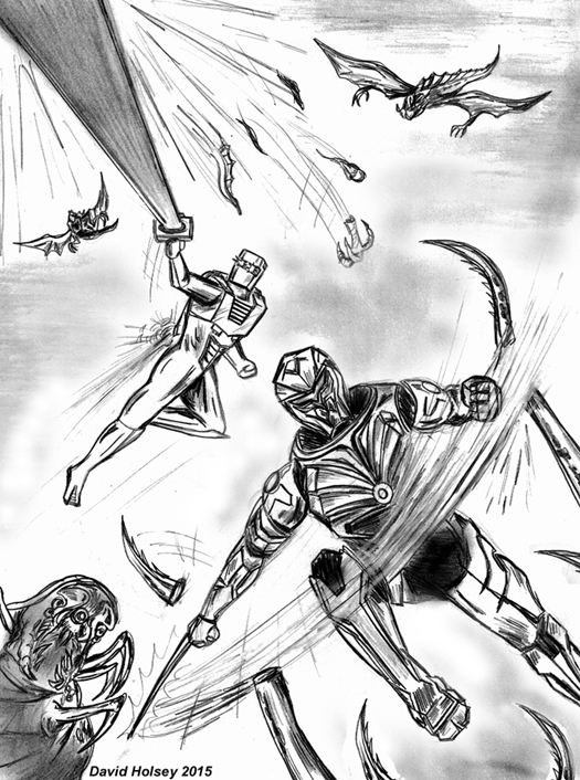
Two things I want to get to but first up here's a sketch I did earlier today as a way to further illustrate something closer to what I would have preferred as an updated ROM design. This is actually more what I thought a full view of ROM would look like based on the cover art for the zero issue when it was released on the internet late last year. As you can see this look has some obvious updates from the 80s version but at the same time doesn't deviate as far from the original as IDW's design. And best of all it's devoid of any Japanese anime influence and in general is less clunky looking. Basically, this is an updated design concept for 2016 that feels more like "ROM" to me.
The following is a copy and paste of the letter I fired off to IDW early this morning and their reply which came only a few hours later. I'm kinda thinking they're not gonna print my letter : )
I'm an old school ROM fan who had given up
long ago on any hope of Marvel bringing back our favorite spaceknight by the
time IDW Publishing had made it's ROM come back announcement last year. At the
time I certainly thought a ROM revival by some fellow old school fans at IDW
would be the next best thing, now I'm not so sure. I'll get straight to the
point about what has disappointed me specifically with IDW's new direction. But
first, in general the art work in the 13 page zero issue story was very flat,
uninspiring and in some panels looked almost down right amateurish.
I also think you guys went
over board with ROM's armor redesign for 2016. The cover art of the zero issue
suggested something that was less drastic and done in better taste then what
appears to be the finalized version as seen in the interior art in which he
looks too "clunky". There's even a ROM#1 cover variant that features
him stepping from a fiery crater which like the zero issue cover art also
reflects a redesign that looks closer to the original but with updates done in
good taste. I also don't like the new design of the neutralizer it looks like
some kind of bizarre kitchen appliance or a high tech back massager from an
infomercial. The new concept for ROM's energy analyzer as being these HAL from
2001 A Space Odyssey looking electronic red eyes on his wrists also doesn't
work for me. I understand that the success of the new series won't depend alone
on the fans who grew up with the original series but was it really necessary to
so drastically change the character from a visual stand point in order for this
new series to have broad readership appeal!?
See, the changes to us don’t seem that drastic at all. Some changes were necessary or required but we tried to keep the spirit of the character as much as possible.
And if you miss the old Neutralizer, well… hope you stay tuned, at least til issue 2...
IDW Letters

May 15th Update
Why couldn't those assholes from IDW make ROM's armor design look like this when it came to the interior art!? Instead this is just for a full page promo ad for the series coming in July and for those of you who have seen Chris Ryall's twitter feed lately you'll see ROM #1 has more of the same shit from the crappy zero issue. And speaking of which for a more insightful review of the zero issue allow me direct you all to . . .http://littlethingsincomics.blogspot.com/2016/05/iexpectedasmuch.html