Last weekend was one of those weekends where I got to chill the whole time and as a result was able to get some cool stuff done in the way of fan art and curating. Although I hate most of what marvel has come up with in recent years I always felt like the Ikon character had promise even though she was no ROM. In fact, the last time I had any hope for marvel to finally do a modicum of justice to the legacy of the greatest of the spaceknights was when we were treated to a panel in the pages of The Avengers of Ikon leading a squad of classic spaceknights to face some mysterious enemy looming over Galador. Anyways, even today I still think ROM returning and having Ikon at his side would have been pretty cool.
 |
| Left click to enlarge |
Picked up this book at the library last weekend. I've seen it before but last weekend I decided to to give it a closer look to see if we might find ROM anywhere in the
Marvel Comics The Untold Story. Needles to say I found the following passage rather interesting although it's hard to say how credible that claim is but I certainly hope it's true. There are two other passing references made to ROM later in the book in regards to
Nova losing his powers and
Secret Wars II tie-ins.
 |
| Left click to enlarge |
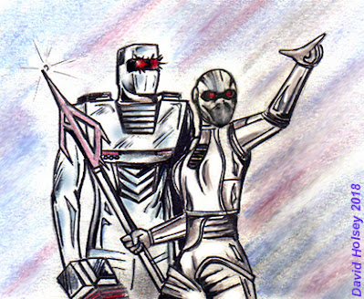
As you can see I even did some other fan art of a satirical nature this past weekend.
 |
| ROM 2016 |
Alright so let's get to what you folks really want to talk about here today because everything on this posting was pretty much done by the end of this weekend. First off a big thanks to
Lee Seitz for bringing this to my attention yesterday. If you haven't checked out the first few pages of the ROM zero issue for FCBD then do so now at the link below before you read on. I like how ROM makes planet fall at
Pismo Beach California I was just there as part of a road trip with my wife on New Years weekend. So on another high note the art work looks great it's nothing at all like steve ditko thank god. Although I would have to say I found ROM's new design a bit jarring.
Now I don't say that because I think his new armor design sucks per se, but more because the cover art certainly didn't leave me with the impression ROM's new armor design would deviate that much from the original as seen in this clip art. It's kinda odd that a company would spend 10 years fighting through legal red tape to obtain the rights to a character and then make such drastic changes to their appearance. In fact, ROM some what resembles the
watch wraith androids he used to fight in the original series. Just not sure it's the right look for him or maybe it's just a matter of getting used to it? I guess only time will tell. This has been a pretty labor intensive posting with all this art work, curating, writing and what not so this will most likely be my last one for quite a while. But I'm looking to hear from you people I want to know what's on your teeny tiny little minds about all this stuff I'm throwing at you in this posting . . . don't let me down . . .
http://www.previewsworld.com/catalogimages/STK_IMAGES_PDF/STK680001-700000/STK698017.pdf
 |
| left click to enlarge |
And a big thanks to our first commentator today for bringing some of the Micronauts cover art from IDW to my attention. This is pretty damn nice! Assuming the cover art we see here is an accurate reflection of what these characters will look like on the inside well then I gotta be honest I'm feeling a bit more optimistic here then I am about ROM.
Baron Karza looks exactly the same as he did in Marvel and they gave
Acroyear an updated look that's really slick but it's still in keeping with how he also looked in Marvel and also a bit like the original
Mego toy.
 |
| Art by marvel and WTF Publishing |
Jan. 25 Update: Two things occurred to me over the weekend. One is, that it seems like people are really squeamish about being forth coming about our first real look at ROM 2016. The second is how IDW's ROM looks more like the horrific manga inspired "spaceknights" of the 2001 mini-series then the Mantlo/Buscema series. I've always prided this blog on posting the sort of content you won't find anywhere else so here goes. I know most of you all are thinking this but I'm gonna just say it straight up, this new look for ROM sucks. After all the hype, fan support, lifting of the red tape and anticipation this is what we end up with? Well, I guess if it could happen with George Lucas then why not with Chris Ryall and Christos Gage as well?


Well he sure looks different then I expected from the cover. Like you say not bad per say just different. His head in this shot reminds me of a ju ju bee but I am still looking forward to it. Oh a two killer Micronauts covers are also out by ryall this is my favorite
ReplyDeletehttps://scontent-mia1-1.xx.fbcdn.net/hphotos-xfl1/t31.0-8/fr/cp0/e15/q65/12615166_10156432682050635_6761631710531442593_o.jpg?efg=eyJpIjoidCJ9
Then this one https://scontent-mia1-1.xx.fbcdn.net/hphotos-xpt1/v/t1.0-9/fr/cp0/e15/q65/12417704_10156432869225635_329063408252606944_n.jpg?efg=eyJpIjoidCJ9&oh=11bd61acbbbbe6471897143fa911a596&oe=5735707E
Man, I never thought this day would come ROM and The Micronauts back in comics at the same time!
ReplyDeleteactually according to a source at IDW we'll be seeing The Micronauts before ROM this year and i think that's why we haven't seen anything about them for Free Comic Book Day. don't want to go into more detail i'd rather stay on IDW's good side.
DeleteI like the update myself, but then again I'm not as personally invested in ROM like you guys are, but it's much, much better than if he'd been rebooted or reimagined over at DC or Marvel. Could you imagine how shitty he'd look then?
ReplyDeleteGood news about ROM and the Micronauts relaunching around the same time. But they're not using Mantlo's created characters right due to Marvel owning them?
I hope you enjoyed that secret history of Marvel comics book Shlomo. I know I did, but it really did leave a huge sour taste in my mouth about Marvel's business practices, both then and now, in large part because they obviously didn't learn much from their past mistakes. Sad really.
just like with ROM IDW can only use The Micronauts characters based off the toys. i just skimmed it i've never been a big book reader i can probably count all the books in my life i've read cover to cover on one hand.
DeleteHuh. well if you ever have the extra time, do yourself a favor and actually read the whole thing man, trust me, it's very eye-opening in terms of historical record and all the behind the scenes dirt about the early days of Marvel through to about 2002/03 that you're gonna' get. Again, despite already knowing a good bit of marvel history, I learned a good bit of new things, and as I mentioned before, it will really tarnish the hell out of those rose-colored glasses we as fans like to wear sometimes when reflecting back on the old days of our childhood, especially about how fucking bad Marvel's business practices back then were and how even back then, how shitty they treated the very people that kept that place going. Just goes to remind us that keyword business in the phrase comic book business, 'cause, no shit right?
ReplyDeleteI was one of those who sort of liked the spaceknights mini all that time ago for what it was. I agree though he looks japanese magna style in this look. I wasnt holding back when I mentioned the ju ju bee head. Sal may do some cover art down the road so lets just see . One shot is not enough to to make me think he will suck. To soon for that for me.
ReplyDeleteWell my friend I've been disappointed one too many times I'm all out of optimism. a few other familiar Rom fans who visit here have also expressed their displeasure with this new look for him but but seem to prefer doing it off the record so to speak. I really just can't comprehend what IDW was thinking with this robotic Franlenstien look they gave Rom here. I spoke to the artist who did the cover art did you know they kept on redesigning Rom's armor even after the cover art was completed and made public? It was fine just the way it was, a bit different then the original but the changes were tastefully done. Anyways, I just need to tune out of all this for a long time I'm actually kinda embarrassed I helped hype the new series on this blog. Are you still at the same mailing address you were at in late 2013?
DeleteInteresting about the cover redone so many times. I didnt know that. He looks nothing like that inside. I suspect the Micronauts may be the same. Will see though. I definitely lost some hype due to the preview. Yes my address is still the same.
DeleteMy biggest problems with the redesign are the head and hands. The rest is fine... We all knew he HAD to have an updated look. Because COMICS. I don't love it, but I would not go as far as to say it sucks. I'll still check it out.
ReplyDelete"Look, I have fingers now!" -Hilarious!!!
I'm curious to see how other artists (Liefeld, Buscema, etc...) interpret the new design when they do covers...
I enjjoyed reading your post
ReplyDelete